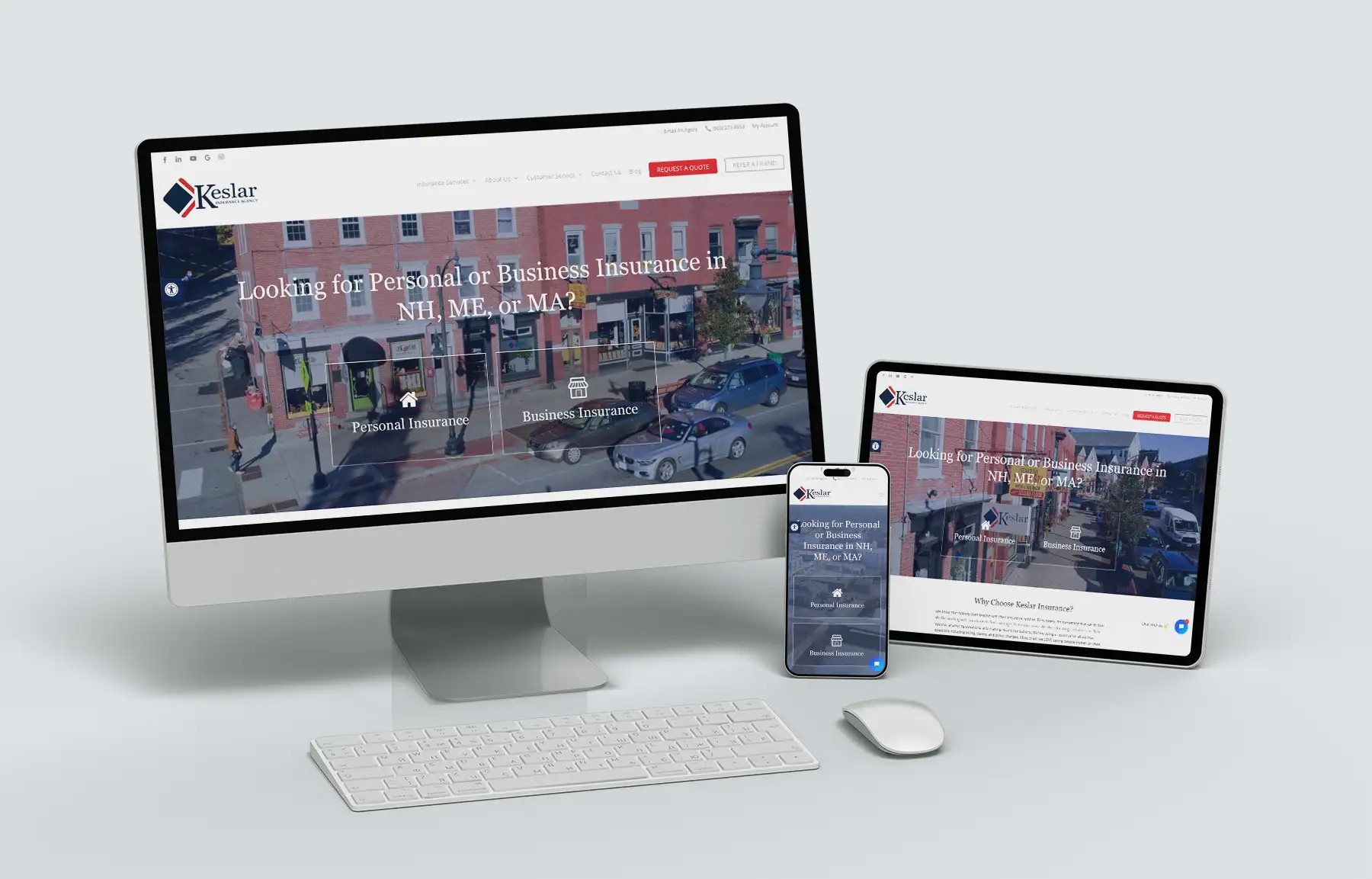
In today’s fast-paced, mobile-driven world, your website is often your first impression and that impression needs to look flawless whether someone’s visiting from their smartphone, tablet, laptop, or desktop.
That’s where responsive web design comes in. A responsive website automatically adjusts its layout and elements to look great and function properly on any screen size.
Whether you’re running a small business, a blog, or an online store, having a responsive website isn’t just a nice-to-have… it’s a must-have. Let’s explore why responsive web design is critical and how you can ensure your website is ready for any device!
Why Responsive Web Design is Non-Negotiable
1. Mobile Users Are EVERYWHERE
Did you know that over 60% of web traffic now comes from mobile devices? If your website isn’t optimized for mobile, you could be losing out on a huge portion of your audience. A non-responsive website is clunky, hard to navigate, and can frustrate users, leading them to leave your site.
Responsive design ensures that no matter where someone’s visiting from, whether it’s their smartphone during their lunch break or their laptop at home, they’ll have a seamless and enjoyable experience.
2. It’s Great for SEO
Search engines, especially Google, prioritize websites that are mobile-friendly. In fact, Google uses mobile-first indexing, meaning it looks at your mobile site first when determining your rankings. A responsive website helps boost your SEO performance by ensuring that your content is accessible and user-friendly across all devices.
3. Builds Trust with Your Audience
Let’s face it… if a website looks outdated or doesn’t load properly on your phone, it sends the wrong message about your business. Responsive design shows that you care about your visitor’s experience and it makes your business look polished and professional. A smooth, user-friendly site builds trust and credibility, making visitors more likely to stick around and engage with your brand.
Tips to Ensure Your Website is Responsive
Creating a responsive website doesn’t happen by accident. It takes careful planning and execution. Here are some tips to make sure your website looks great and functions beautifully on every device:
1. Use Flexible Layouts
Responsive websites use fluid grids that adjust the size of elements (like images, text, and buttons) based on the screen size. This prevents content from looking squished on a smartphone or stretched on a large desktop monitor.
Tip: Avoid setting fixed widths for elements. Instead, use percentages so content automatically resizes.
2. Test on Multiple Devices
Before you launch your website, test it on various devices, screen sizes, and browsers to ensure it looks and works as intended.
Tip: Check how your site performs on iPhones, Android devices, tablets, and desktops. Don’t forget to rotate your device to test both portrait and landscape orientations!
3. Optimize Images and Media
Large, high-resolution images can slow down your site, especially on mobile devices. Compress your images to ensure they load quickly without losing quality.
Tip: Use modern image formats like WebP or ensure images scale appropriately for smaller screens.
4. Simplify Navigation
Mobile users often prefer simple, intuitive navigation. Consider using a collapsible hamburger menu for smaller screens to save space and make your site easier to explore.
Tip: Avoid overloading your menu with too many options. Keep it concise and user-friendly.
5. Check Font Sizes and Buttons
What looks great on a desktop might not work on a phone. Fonts that are too small and buttons that are too close together can frustrate users on smaller screens.
Tip: Make sure fonts are legible, and buttons are big enough to tap comfortably with a finger.
6. Speed Matters
A responsive website isn’t just about how it looks… it’s also about how fast it loads. A slow-loading site can cause visitors to leave before they even see your content.
Tip: Minimize your use of heavy scripts and enable browser caching.
Your Next Steps: Make Responsive Web Design a Priority
Responsive web design isn’t just a trend, it’s an absolute necessity for businesses in today’s mobile-driven world. By creating a website that adapts seamlessly to any device, you’ll provide a better experience for your visitors, boost your SEO rankings, and show your audience that you care about their time and convenience.
Ready to upgrade your website? Let’s talk!
If your website isn’t responsive, or you’re not sure if it is, it might be time for an update. At LD Creative Designs, I specialize in designing websites that look stunning and work beautifully on every screen. Together, we can create a responsive, user-friendly website that reflects your brand and keeps your audience engaged.
Contact me today to schedule a consultation and let’s create a website that not only looks beautiful on all devices, but functions in a way to encourage your visitors to become your next customer.