At the heart of every memorable brand lies a powerful logo – a symbol that encapsulates its essence, values, and voice. For Sour Grapez, a brand dedicated to spreading laughter and joy through witty and clever products, their logo needed to be more than just visually appealing; it had to tell a story. In this post, I’ll take you behind the scenes of designing the Sour Grapez logo, a perfect emblem of their playful, intelligent, and charismatic nature.
Understanding the Brand
Before putting pencil to paper, I immersed myself in the Sour Grapez world. Their mission to bring smiles and laughter into daily life through smart, sassy products was my guiding light. The brand’s personality is daring, imaginative, and disruptive, pushing boundaries while remaining approachable and relatable.
The Logo Design Journey
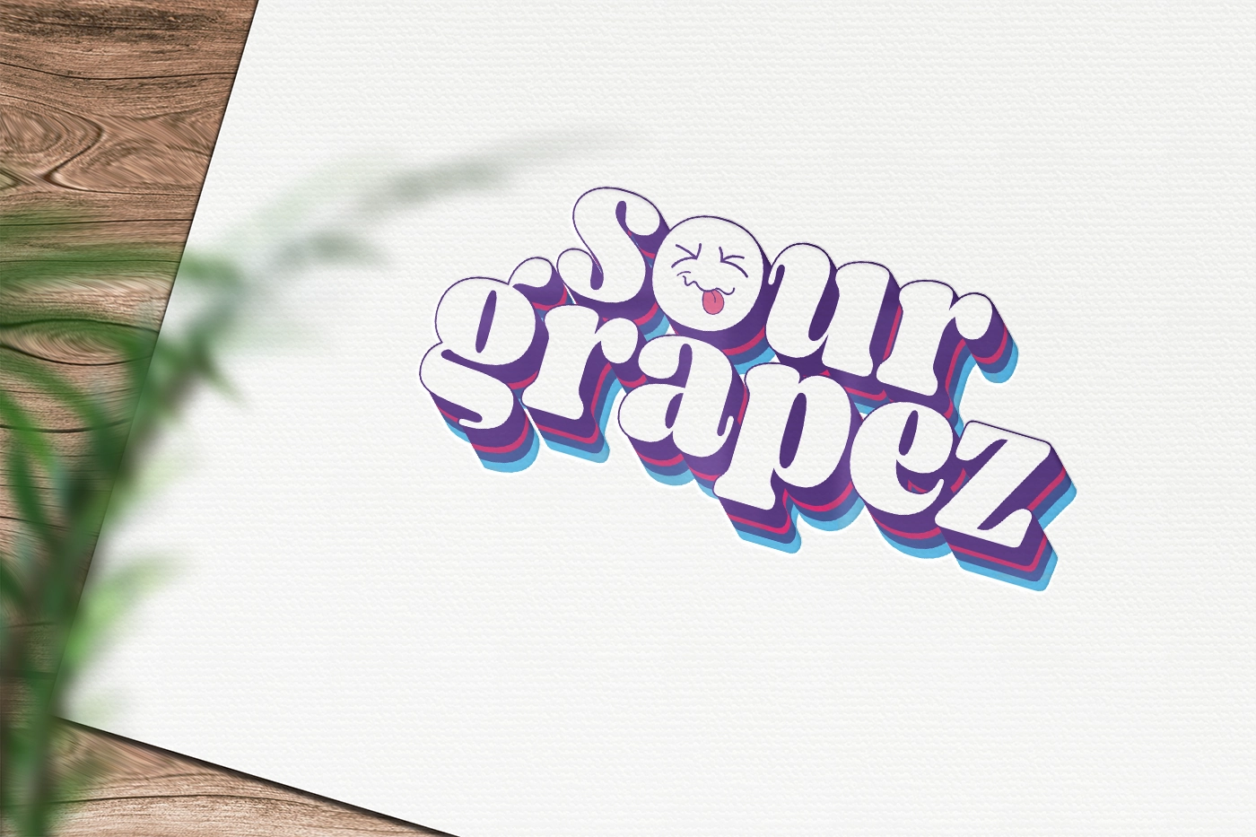
My goal was to create a logo that reflects Sour Grapez’s unique character. One of the original concepts that I came up with was a groovy, retro style, harkening back to an era known for its bold expressions and free-spiritedness. This choice wasn’t just aesthetic; it was a nod to the brand’s ethos of embracing adventure and challenging the status quo.
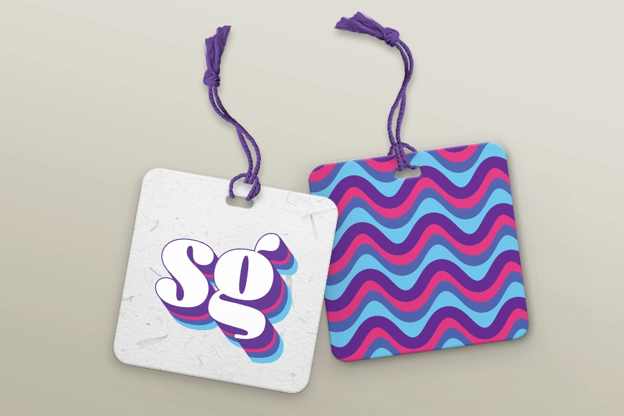
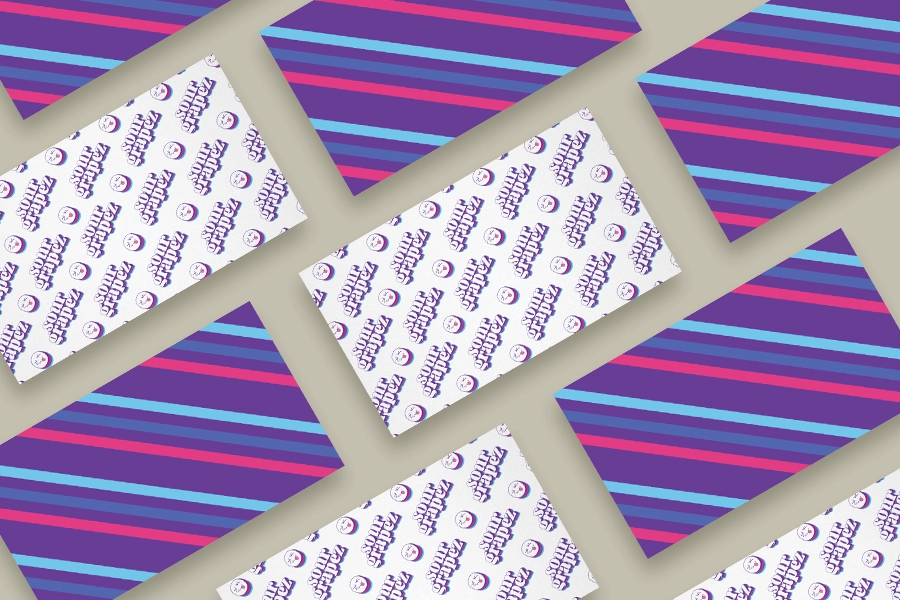
The centerpiece of the logo is a puckered, sour face, which immediately conveys the brand’s playful and cheeky nature. This imagery, combined with a lively color palette, creates an inviting and engaging visual that’s hard to forget. The use of vibrant colors also speaks to the diverse range of products Sour Grapez offers, appealing to a broad audience.
Balancing Humor and Professionalism
One of the challenges I faced was striking the right balance between humor and professionalism. The logo had to be fun and witty, yet sophisticated enough to establish trust and credibility. I ensured that the logo maintained a professional look while still being playful by choosing a bold, modern typeface and incorporating clean lines.
Resonating with the Target Audience
Sour Grapez’s target audience is incredibly diverse, ranging from young adults to seniors. My logo design needed to resonate across this broad spectrum. The nostalgic feel of the logo appeals to an older demographic, while the vibrant colors and playful imagery connect with younger audiences. This universality ensures that the Sour Grapez logo is not just seen but felt, creating an emotional bond with everyone who encounters it.

Thank you for all your creative energy. This is all so exhilarating for me!
Emily Musto, owner of Sour Grapez
Conclusion: A Logo Design That Laughs
The Sour Grapez logo is more than just a symbol; it’s a conversation starter, an invitation to embrace the lighter side of life. It perfectly encapsulates the essence of the brand – a beacon of humor, wit, and joy in a world that often takes itself too seriously.
In the end, the Sour Grapez logo stands as a testament to the power of thoughtful, emotionally resonant design. It’s a visual representation of the brand’s commitment to making everyday life a bit more enjoyable, one laugh at a time.